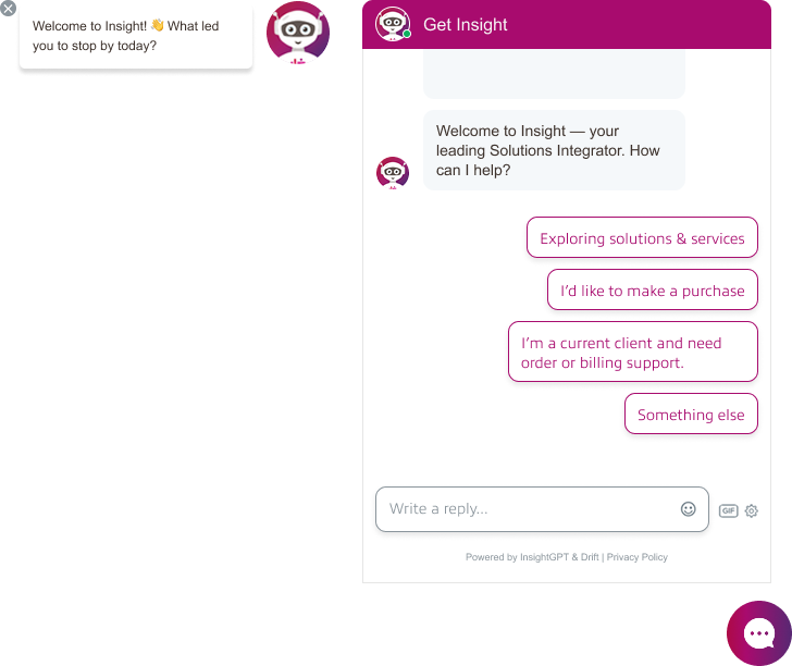
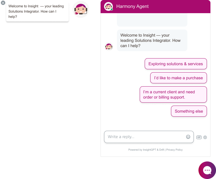
Insight Chatbot Icon Redesign
Problem:
In a previous NPS survey, users expressed discomfort with the chatbot’s alien icon.
Some of the feedback included:
“The alien icon is creepy.”
“Change the alien icon to speak to a bot on-line. Creepy.”
My Role & Contributions:
To address this, my team and I conducted a competitive analysis of chatbot designs used across e-commerce platforms. We explored several design directions:
- A simplified version of the company logo
- A redesigned robot icon
- A cartoon-style human
- A realistic human avatar
I designed the cartoon-style human icon in Adobe Photoshop using custom shapes and vector elements. These designs were submitted to the chat experience team, who conducted a stakeholder survey. My cartoon human icon was selected.
The chatbot was later named Harmony Bot by the chat experience team to reflect Insight’s brand pillars: Heart, Hunger, and Harmony.
Outcome:
In the next NPS survey cycle, we received this feedback:
“I am happy to see that the chat picture is no longer a creepy alien and at least looks like a cartoon person! :)”
Conclusion:
This change helped improve user perception and made the chatbot feel more friendly and approachable.
Insight Public Sector - Logged Out Experience Redesign
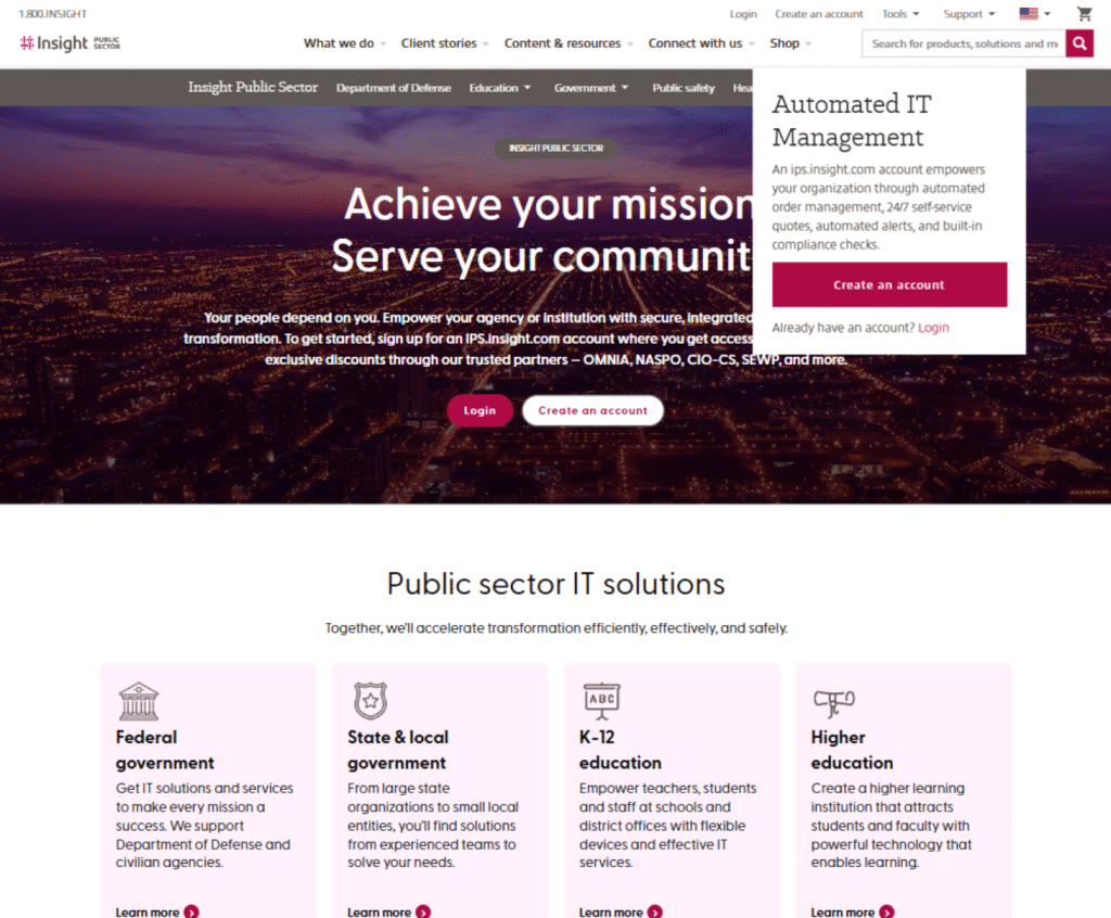
Goal:
Only 9% of customers were using the IPS subdomain to make purchases, create quotes, or manage their accounts. Most clients relied on their sales representatives instead of the website. The business goal was to increase visibility of the IPS subdomain and improve the logged-out experience, since unclear messaging and limited guidance discouraged customers from creating accounts and transacting online.
Pain Points:
- Visibility and access – users had difficulty finding and accessing the IPS subdomain within the site.
- Confusing account setup process – users needed contracts before purchasing, but the process was not clear.
- Cart behavior when logged out – items added to cart were dropped after login since purchases required a specific contract.
- Lack of guidance – users did not understand the value or privileges of having an IPS account.
My Role & Contributions:
- Helped in conducting user surveys with sales representatives to understand why customers preferred working with reps instead of using the website.
- Collaborated with the senior UX designer to create user journey maps and document the logged-out user flow.
- Added access points to IPS in the main navigation, shop page, and home page to improve visibility.
- For account creation, added CTAs to log in or create an account directly on the IPS homepage and designed a modal explaining the privileges of having an account.
- Removed “Add to Cart” buttons from logged-out pages and replaced them with “Login” or “Create an Account” to prevent cart drop issues.
- Contributed to wireframes and UX recommendations that simplified actions, improved clarity, and encouraged more customers to self-serve online.
- Presented the high-fidelity mockups to management and key stakeholders to gather feedback, align priorities, and refine the final design direction.
Insight Category Pages - Redesigned
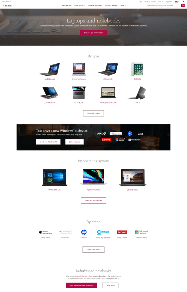
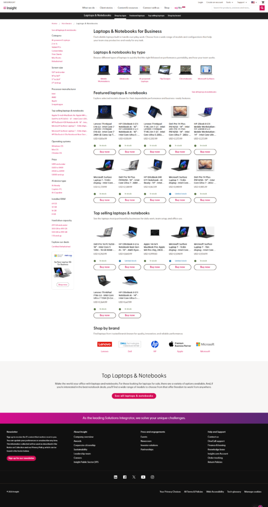
Goal:
To improve discoverability and engagement within category pages by providing users with more relevant content, filtering options, and product visibility.
Pain Points:
- Outdated layout with minimal content and unclear product categorization.
- Poor discoverability of products and limited filtering options.
- Lack of visual appeal and user engagement.
My Role & Contributions:
- Led the redesign of the category pages, as an initiative of my manager, collaborating closely with my teammates.
- Conducted competitive analysis and referenced Baymard Institute research to identify eCommerce best practices for navigation, filtering, and product presentation.
- Used Microsoft Clarity to analyze user behavior and uncover usability issues in the old design.
- Created high-fidelity mockups focusing on visual hierarchy, usability, and accessibility.
Outcome:
Based on Adobe Analytics data, the redesigned category pages contributed to a threefold increase in revenue, indicating a significant improvement in user engagement and discoverability.
Insight Short-term Leasing Options
View website →
(For Apple products only.)
Goal:
Introduce a short-term leasing option within the purchasing experience to help customers explore flexible financing directly through the website.
My Role & Contributions:
- Collaborated closely with senior UX designer, product owner, key stakeholders, financing team and developers to gather requirements and align on business goals.
- Created wireframe and high-fidelity mockup of a modal that introduces users to Insight's leasing and financing services.
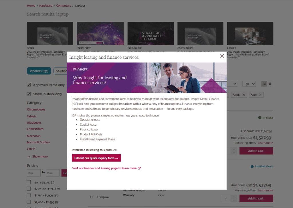
- Added a "Financing offers" label to the search results for Apple products, including PDPs, which will have the link that says "Learn more". This will open a modal.
-
Designed the modal to include:
• A brief introduction and description of the available lease types
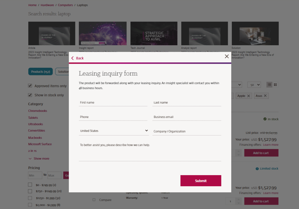
• An option for users to submit a form that captures the SKU or product they are interested in leasing
• A "Learn more" CTA that redirects users to the financing landing page for additional information. - Led the presentation of the mockups to management and developers to gather feedback and align on improvements.
- Ensured the flow was clear, informative, and easily accessible within the purchasing journey (Search results page and Product detail page)